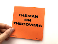
From my initial ideas, I have further developed the design through changing the grid composition of the content in order to look optically balanced on the square page. I thought that doing this would make it easier fro the readers to follow through the report better as well as help them navigate through the concertina. In addition, I also added a heading to further emphasise the hierarchy of information within the publication. I also added images giving visual link to the written content.
In addition, I decided to to highlight parts of the interview which I think had impact to me and will have impact to the readers, making the overall design and zine more educational and informative reflecting the overall mode of the interview.
I think digitally printing it is the most economical way of printing the design as it's fast and efficient, however I do still want to screen print it though I know it will take a much much longer time, I want to get a raw and rough style out of the design, making the design more personal in a way. Furthermore, because it's a concertina, when screen printing I have to make sure that both sides are lined up and because the paper stock that I'm currently experimenting on it too opaque it will be quite hard to do this. Lining it up may be a problem - possibly cutting it to actual size will work? or drawing bleed or crop marks both sides? I will have to think of a solution for this.
Thoughts & Reflection:
I think this experiment went okay and actually might be better than screen printing as it very quick and easy and though I though want to see how a more raw and handmade textured outcome will look I think the sleek and professional finish on the printing compliments the serious and educative tone of the overall interview.
In addition, after putting together the rough draft of the publication, I realised that I haven't included my thoughts on the actual interview itself within the design (kind of like a narrative) which I think would be more appropriate if it's put within the publication as it shows my own reflections and what I think about Rick Cho's answers and his ethos and if they fit my own principles and what I believe in as well.
In addition, there are also some design aspects which I need to change, as I found them more prominent when I printed out the physical version of the publication:
- Title needs to be put on the back page the front page can be folded inwards rather than outwards.
- Use more of the Craw Modern URW serif type in order for a more noticeable contrast between the two typefaces.
- Have a more significant reason for the grid system.
- After peer feedback, the letterset on the quote page was deemed too awkward as words like 'concern' was separated making it hard to read. I will change this and make sure the letterset is legible.
- Leading is too far apart for the subheading, making the subheading bigger than it actually is - will have to tighten it a bit.


No comments:
Post a Comment