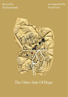
There's also a reoccurring theme of eyes on the poster, in order to represent all the people that were looking for Khaled and judging him for being different in the country, however this could also represent all the people that are looking after him e.g. his friend and Winstrom. I also represented Winstrom's alcoholic wife and by using the 'glittery depressed eyes' it could represent the emotions he was feeling throughout their failing marriage.
I think this poster represents the film effectively as well as From From's style without being pastiche as it captures the key moments in the film and ties together events that are significant throughout. It can also intrigue an audience due to it's raw and hand-made style which also links to the film being very deadpan and raw.
For this development, I used the red and brown poster design from two days ago. I decided to develop the handmade 3D poster and refine it through Photoshop in order to make it look cleaner and professional. It also links to From Form's way of working as they said before how they'd like to make everything by hand first then put it through Photoshop or After Effects. I think the black and white works well together as it compliments the brown paper that represent's Khaled's illegal documents which got him to stay in Finland thanks to Winstrom's help. The white string also represents all the help that his got the sympathy his received from people e.g. Winstorm, his friend and his workmates. However, I don't really think this design is that strong compared to the one above as it has weak connotations to the film and I think if people that see this poster and see the film for the first time will be confused as to what the correlation are between the two and I feel like it would make them feel led on to a completely different film that they might be expecting, although I do like it aesthetically I just don't think it's strong enough in terms its meaning.


No comments:
Post a Comment